 Work
Work
Music has always been a big creative outlet for me and my brothers. We grew up playing piano, and over the years, I turned that love into an exploration of DJing — which eventually evolved into a fun and expressive side-hustle.
Through this musical project, I’ve learned that being a successful artist today takes more than talent — it also requires a strong, cohesive brand identity. I took the lead on developing all of our digital content, including event flyers, promotional videos, logo design, and all things visual.
Tools: Photoshop, Illustrator, After Effects, Logic
Before teaming up with my brother, I was already crafting flyers and digital content for his solo performances. The designs weren't always consistent, but they leaned toward darker, high-contrast visuals to draw attention to key event details. I also designed the original “BLUTIE” logo, which became a unifying element across all visuals. Much of the early design direction was influenced by the types of venues he played — which tended to attract younger, college-age crowds.
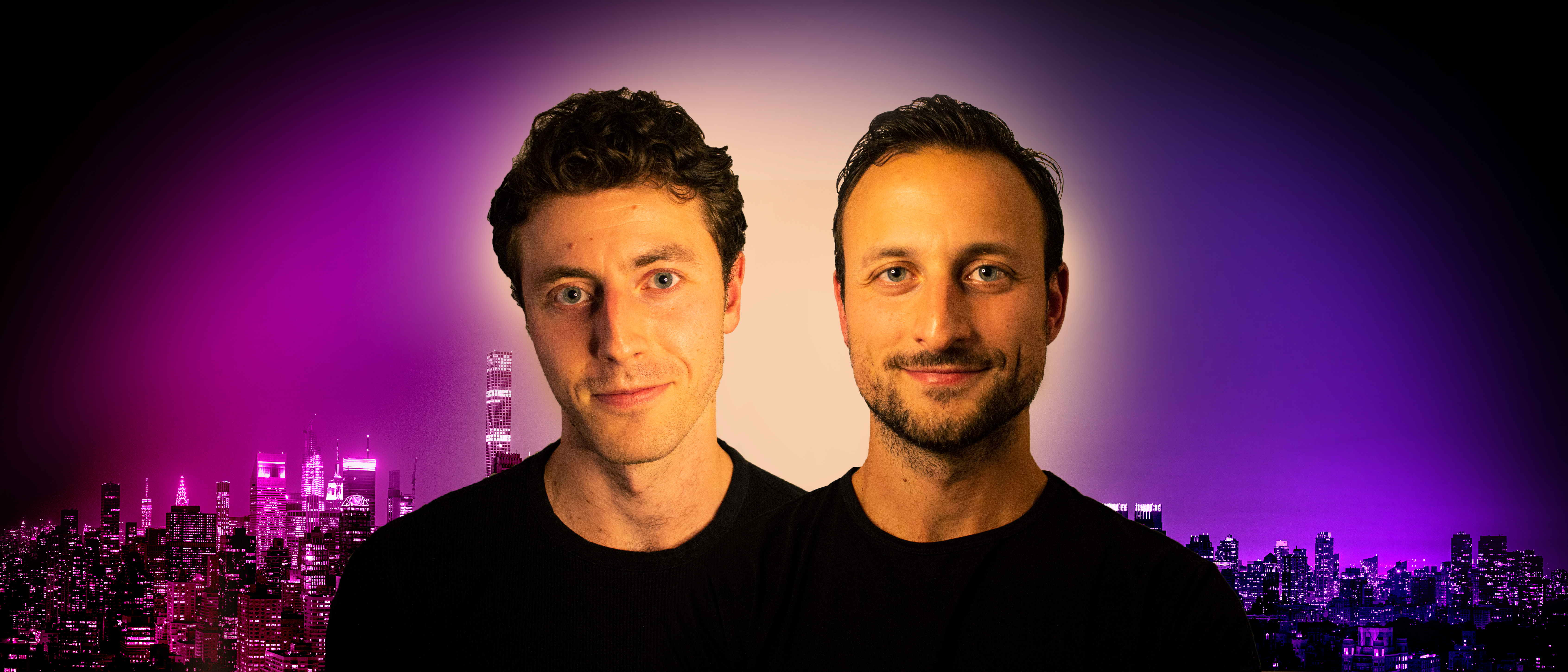
When we officially joined forces and rebranded as “Bluti Bros” — a nickname we’ve always been called — I became more intentional with color palettes, visual hierarchy, and overall styling.
I made it a point to design a logo that could serve as a unifying identity across all of our flyers and digital content. I wanted something minimalist and adaptable — black and white, reflective of our name, and representative of us as a duo. The final design is a continuous line that traces two interlocking "B"s, symbolizing our connection and shared creative voice. It also works well across formats and, more importantly, it felt unique and something with no prior associations, making it feel distinctly ours.
The design went through quite a few iterations before reaching the current version.
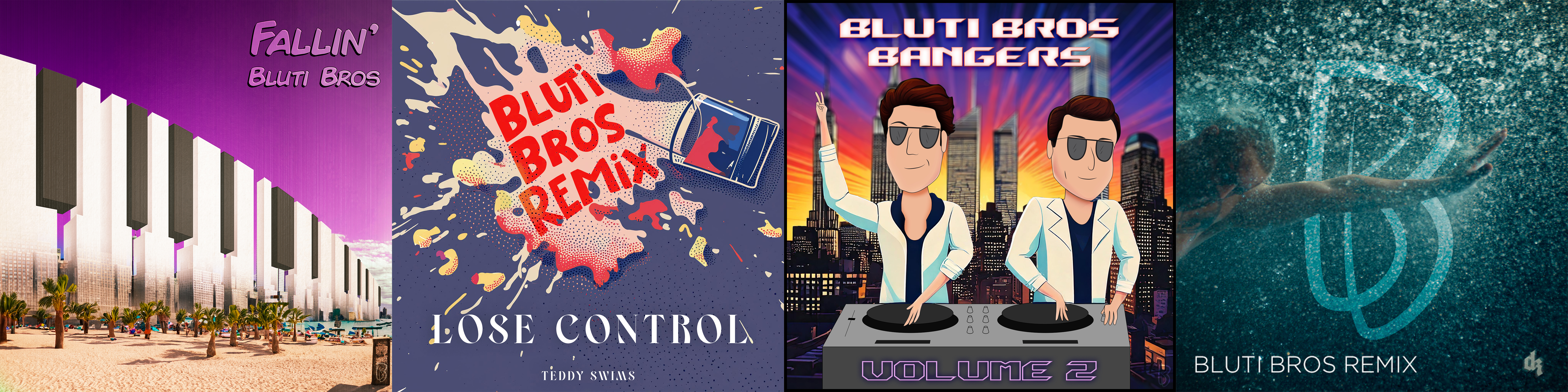
I evolved our brand identity from a playful, cartoon-inspired look (which matched our genre-blending mashups) to a more refined aesthetic, centered around a stylish double “B” logo.
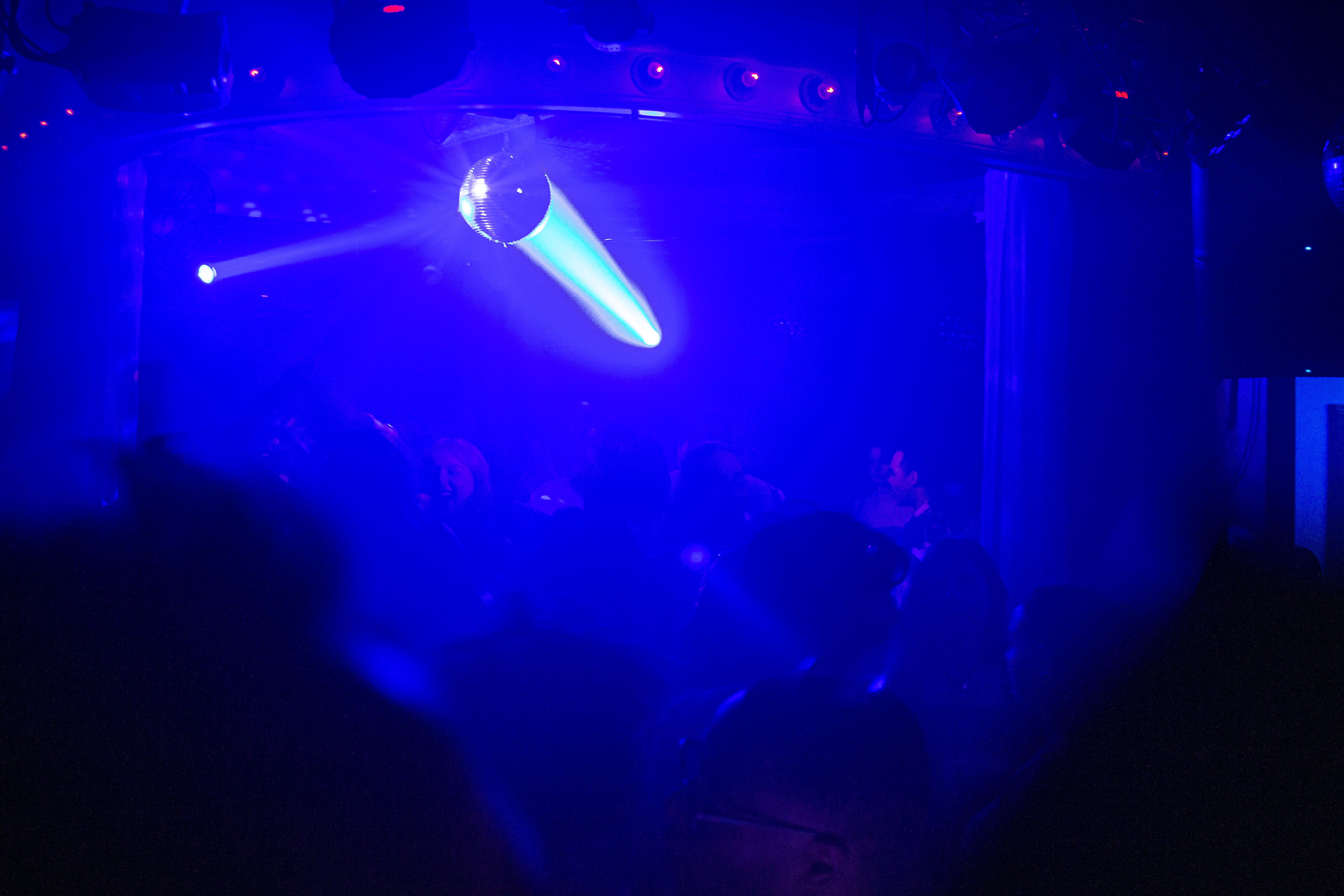
We typically perform at elevated lounge and club venues, and our music leans toward open-format sets with a focus on disco and house. I try to match that energy with eye-catching visuals: saturated colors, bold typography, and consistent design language.
Since we often produce original mashups — blending 3 to 5 tracks into one cohesive piece — I created a consistent style for our song cover art. Each cover uses a signature font, original photography (which I shoot myself), and our logo in the corner to build brand recognition.
As we’ve started creating original music, I’ve taken a more experimental approach to design — blending AI-assisted tools like Adobe Firefly with custom illustrations and textures.
To increase audience engagement, I also began producing video content for stories and posts, using Adobe After Effects to sync visuals with music and create smooth, eye-catching transitions.
Aside from how creatively fulfilling it’s been, this project has pushed me to grow my skills in branding, motion design, and audience communication — all while having a blast making music with my brother.